Brand
How Relationshipss looks and sounds. One idea runs through all of it, so most of this page is that idea applied to a mark, a palette, a typeface, a voice, and a drawing. The files are at the end.
Identity 1.0 · 12 October 2026 · Digital assets and print templates
The idea
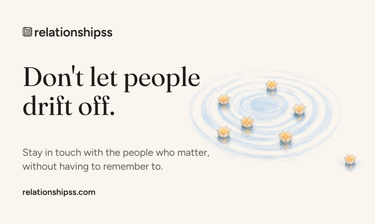
Don't let people drift off.
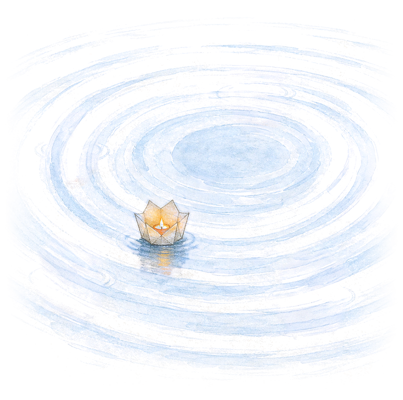
You are a still point in the water. The people you don’t want to lose float around you, each at their own distance, each on their own ring. Some you talk to every week. Some every few months. Both are fine. What is not fine is when one slips past their ring and keeps going, because life got busy and nobody meant it.
The product shows you that picture every day, names the one person who has gone quiet, and lets you say “we talked”. Nothing else. Every choice below, from the orange to the pencil lines, serves that one idea.
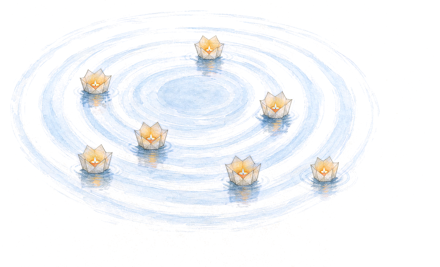
Together, the lanterns make a pool of warmth. The water leaves room for each person to come closer in their own time. Distance is a moment in a friendship, never a measure of someone’s worth.
The name
Relationshipss, with two s at the end, because that is the address: relationshipss.com. In running text it is capitalised like a name. As a wordmark it is always lowercase, set in Figtree semibold with the letters pulled a touch closer. Say it the ordinary way. Never shorten it, never add a dot, never split it.
The mark
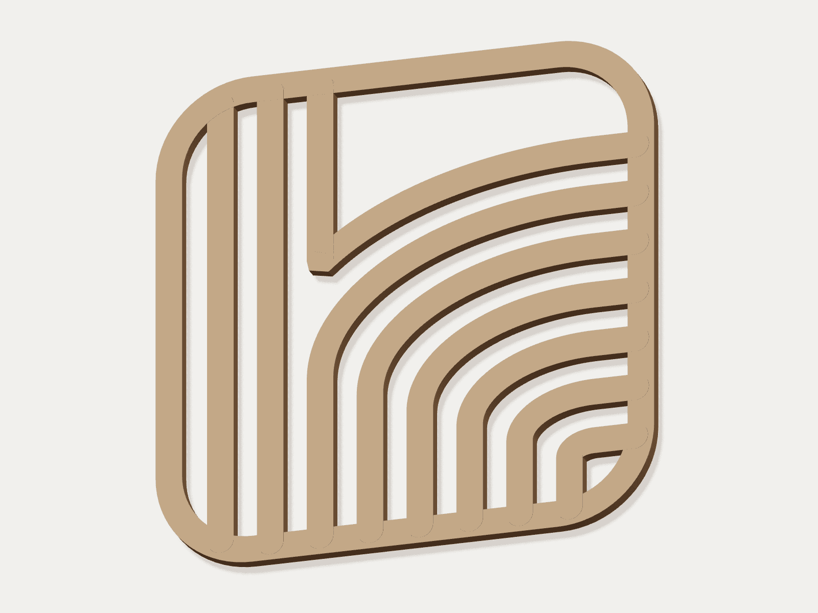
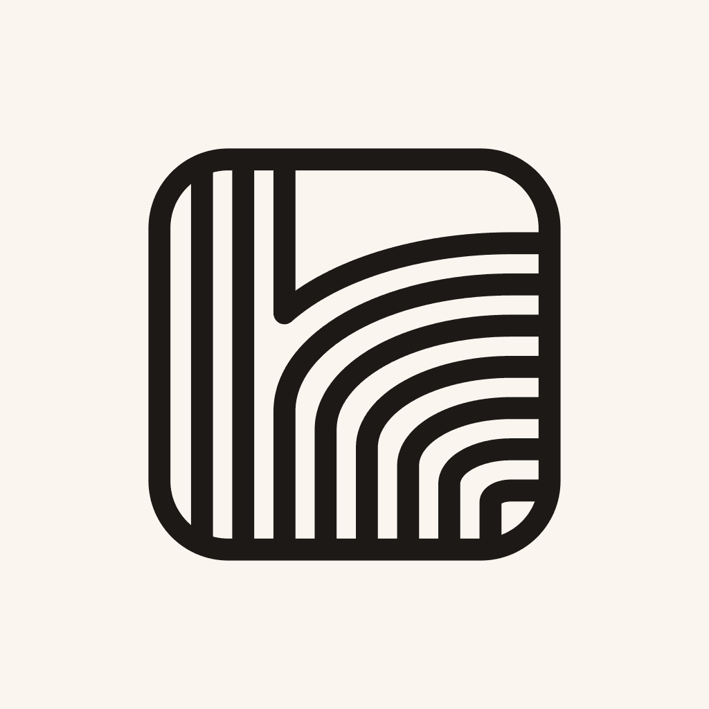
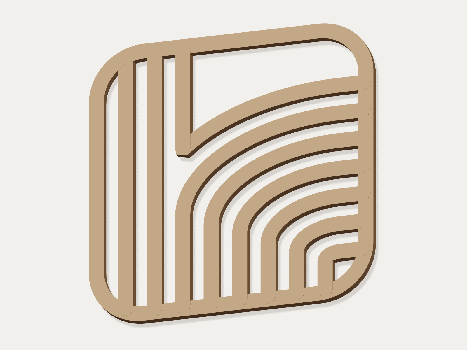
The junction of the r, in ripples. A soft tile holds lines of one weight, like the contour lines of still water. On the left they run straight down: the stem of the r. On the right they sweep round in low arcs, each dropping into its own leg: the stroke of the r turning right. The third line runs into the outermost arc and makes the one sharp corner, where the two strokes meet. It is a close-up of the one place the letter is itself, so the r is felt, not read. The smallest arc leaves a pocket in the corner.
It is ink on paper. On dark it is paper on ink. The signature carries no gradient, shadow, or second colour, and the lines are never thick and thin: one weight, evenly spaced, running into the frame.
Sizes and space
- Three cuts, one mark. The full mark, with its eight lines, from 48 pixels or 12 millimetres. The middle cut, with five, from 24 pixels or 8 millimetres. The small cut, with four, at 16–23 pixels or 5 millimetres. The lines get fewer and heavier; nothing else changes.
- Keep clear space equal to one quarter of the mark’s square canvas, on every side.
- Use the supplied lockup. Keep the lowercase wordmark, its spacing, and both final s letters intact.
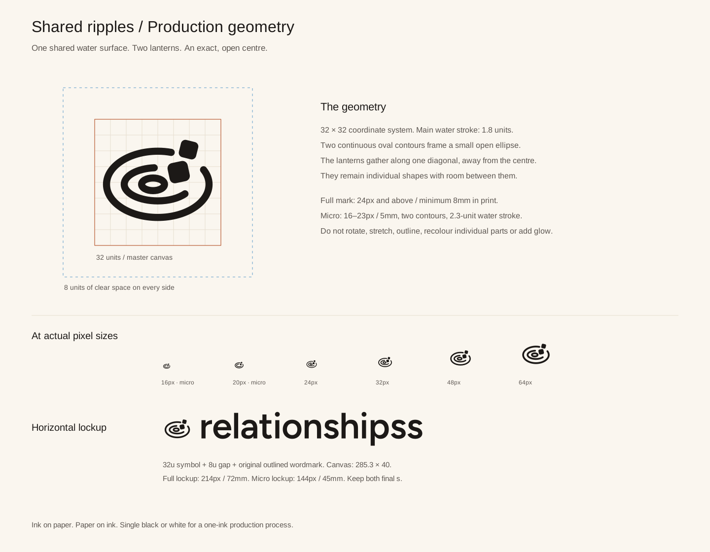
- Full lockup: at least 214 pixels or 72 millimetres wide. Small lockup: 144 pixels or 45 millimetres.
- Wordmark alone: at least 120 pixels or 32 millimetres wide. Leave the supplied proportions intact.
- Ink, paper, or ember. Solid black or white is reserved for one-ink production. Use a plain ground.
The dot at the centre of the product’s picture still means “You”. It is a product symbol. The tile is the brand’s signature.
Colour
Cream paper, warm ink, and two colours that mean something: sky for close and for the water, ember for the one thing that needs you. Ember is a signal, not a theme. If a screen is mostly orange, something has gone wrong. Dark follows the system setting and keeps the same meanings.
- Text is always ink or ink 2 on paper, or paper on ink. Coloured text uses the “ink” version of its colour.
- Ember means: gone quiet, up today, we talked. Nothing decorative is ever ember.
- Sky means close, and the water in the picture. It never carries a warning.
- No pure black, no pure white, no grey without warmth.
Type
Two faces. Fraunces, a warm serif, for the one line that matters on a screen: the greeting, the headline. Figtree, open and even, for everything you read after it. Body text is 17 pixels, a little larger than the web’s habit, because the people on the list deserve to be read easily.
Fraunces, the one line
Good evening. Dad has gone quiet for about three weeks.
Figtree, everything else
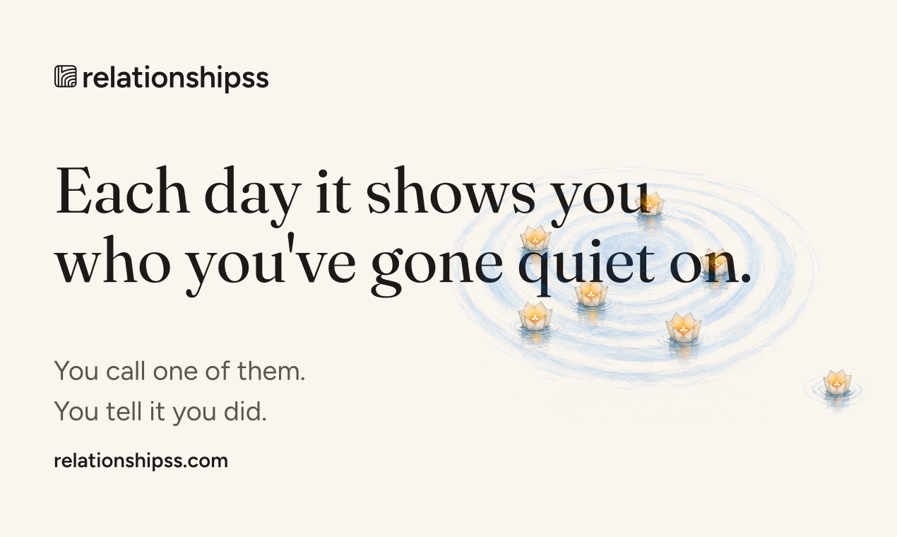
Each day it shows you who you’ve gone quiet on. You call one of them. You tell it you did.
About 6 weeks. You usually talk monthly.
- Fraunces only once per screen, and never below 24 pixels.
- Weights: 400 for reading, 500 for names and labels, 600 for the wordmark and headings.
- Tight tracking on big type, a little letter-spacing on tiny uppercase labels, nothing else.
- No italics, no all-caps sentences, and no text in ember or sky unless it is a name or a stage.
Shape
One soft shoulder. Every rounded thing has three corners at a base radius and a larger top-left corner, like a page with one corner turned. Buttons, cards, and sheets all share it, at their own sizes.
Lines are hairlines, one pixel, in the line colour. Shadows are rare and soft, only under a sheet that floats over the page.
Voice
A friend nudging you, never a tool scolding you. Plain English. Short sentences. Simple hard truths. It names the person, says how long it has been in ordinary words, and stops. It never counts your failures, never praises you, and never uses an exclamation mark.
Good morning. Priya has gone quiet for about six weeks.
You have 3 overdue contacts!
One person, by name. Time in words. No count of failures, no exclamation mark.
Nothing for today. Everyone is close.
Great job! You're all caught up
Calm is the reward. No praise, no emoji.
Noted. Priya is close again.
Interaction logged successfully.
Say what happened to the person, not to the system.
Don't let people drift off.
Nurture your network with smart reminders.
One plain instruction. A simple hard truth beats a feature list.
- One instruction at a time. If a sentence has two asks, cut one.
- Time in words: “about six weeks”, “three days”, “usually monthly”. Numbers only when they are small and plain.
- Nothing is a debt, a score, or a tally. Nobody is late. They have gone quiet.
- The product speaks of itself as “it”, and says “we” only when the people who make it are speaking.
Words
The words the product uses, and the ones it never will.
- peoplecontacts, connectionsThey are people you know, not entries.
- the listnetwork, CRM, pipelineIt is short on purpose.
- gone quietoverdue, lapsed, inactiveNobody is late. It just went quiet.
- drift offdrift, churn, decayAlways with “off”. Bare “drift” reads unfinished.
- closehealthy, active, engagedThe water inside the line.
- we talkedlogged, checked in, touched baseYou say it, in your own words. Nothing counts until you do.
- latersnooze, dismiss, skipHold them off Today, kindly.
- callreach out, ping, follow upSay the real thing you will do.
- the picturechart, graph, dashboardIt is a drawing of your people, not a report.
- Youuser, profile, accountThe still point at the centre is you.
The three stages are close, drifting off, and gone quiet. The line between the last two is the one drawn by hand in the picture.
The picture
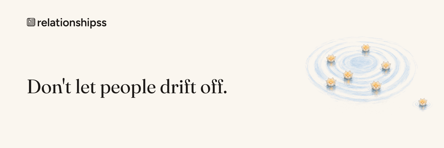
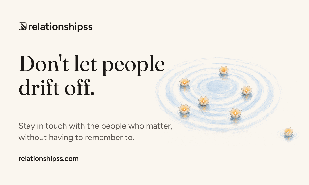
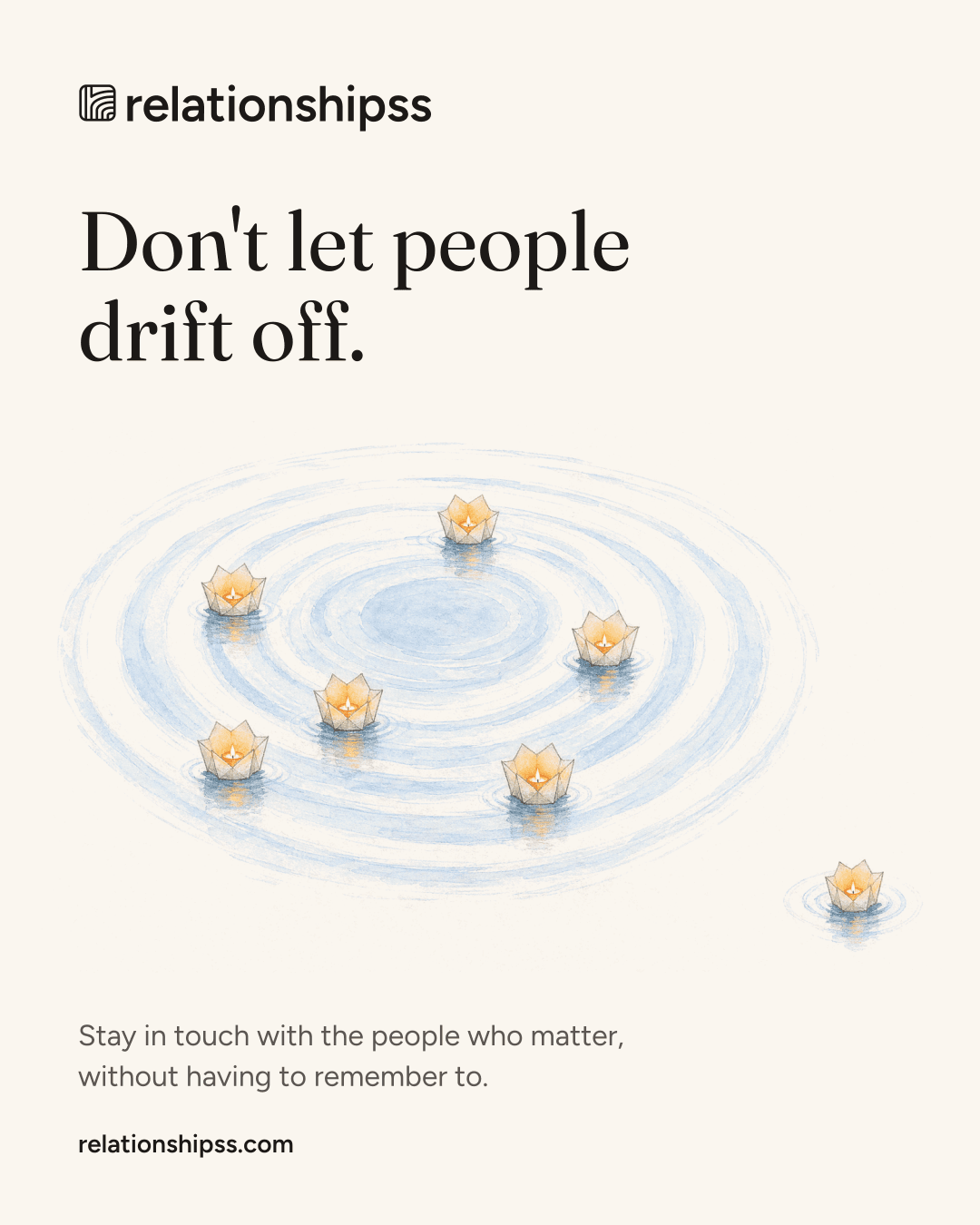
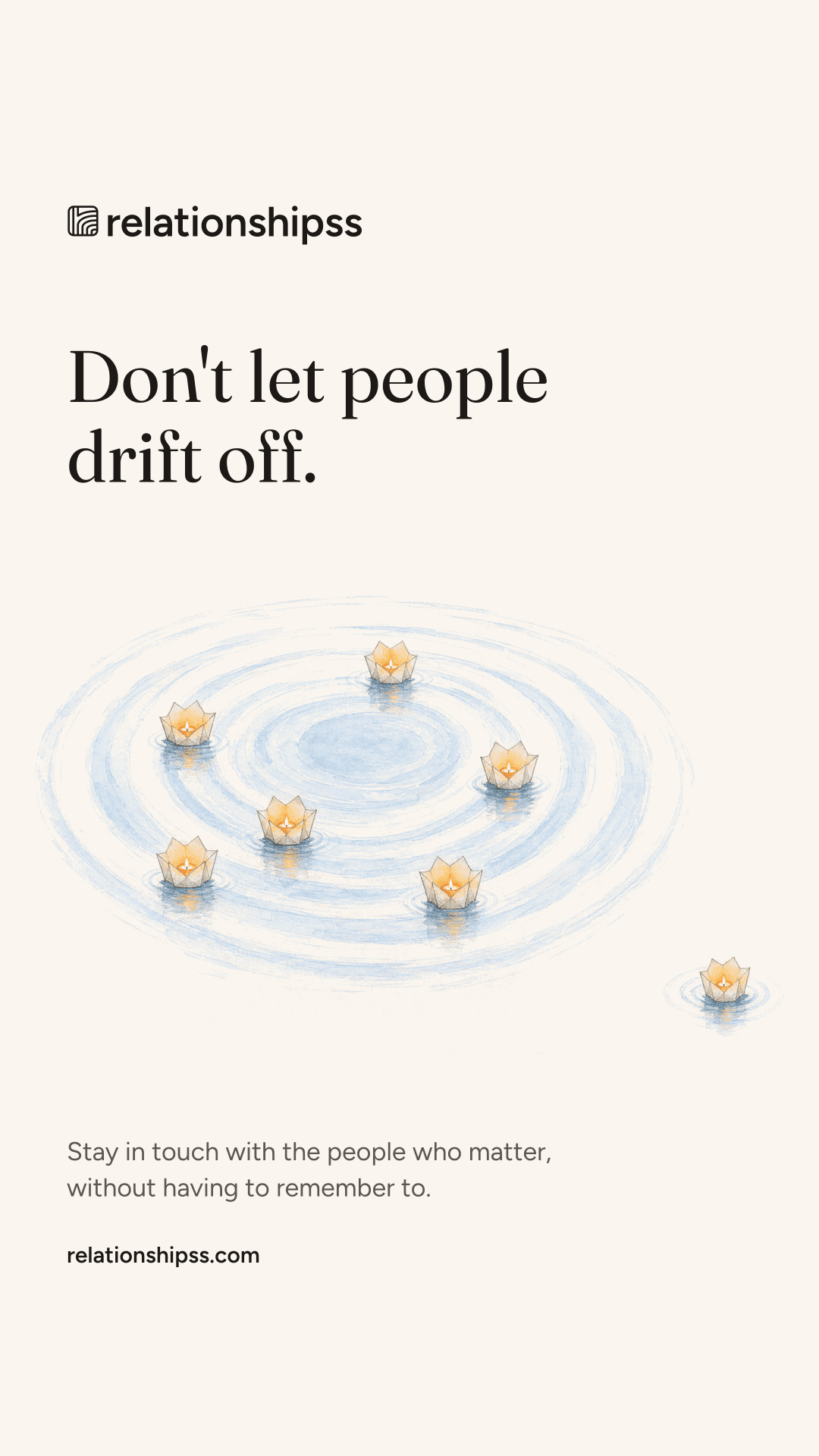
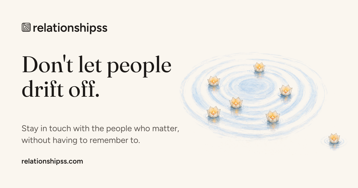
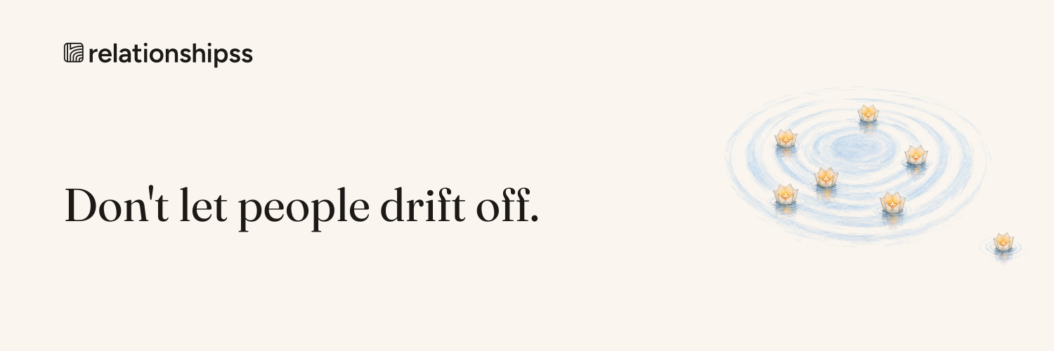
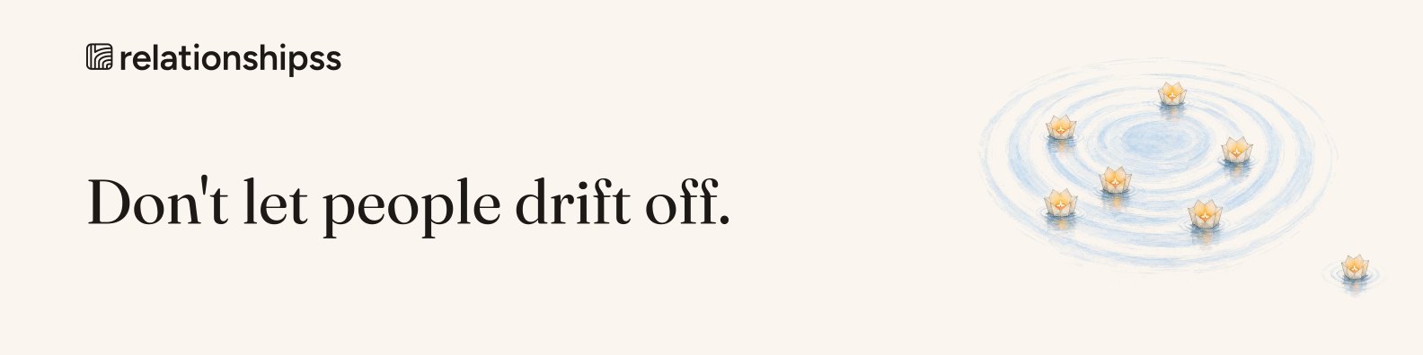
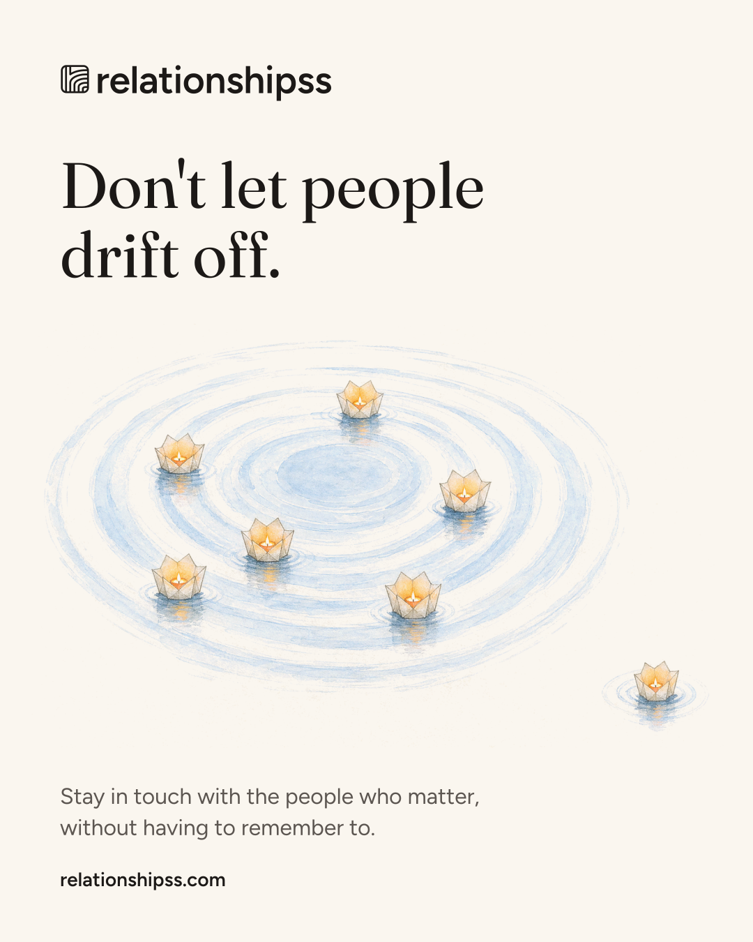
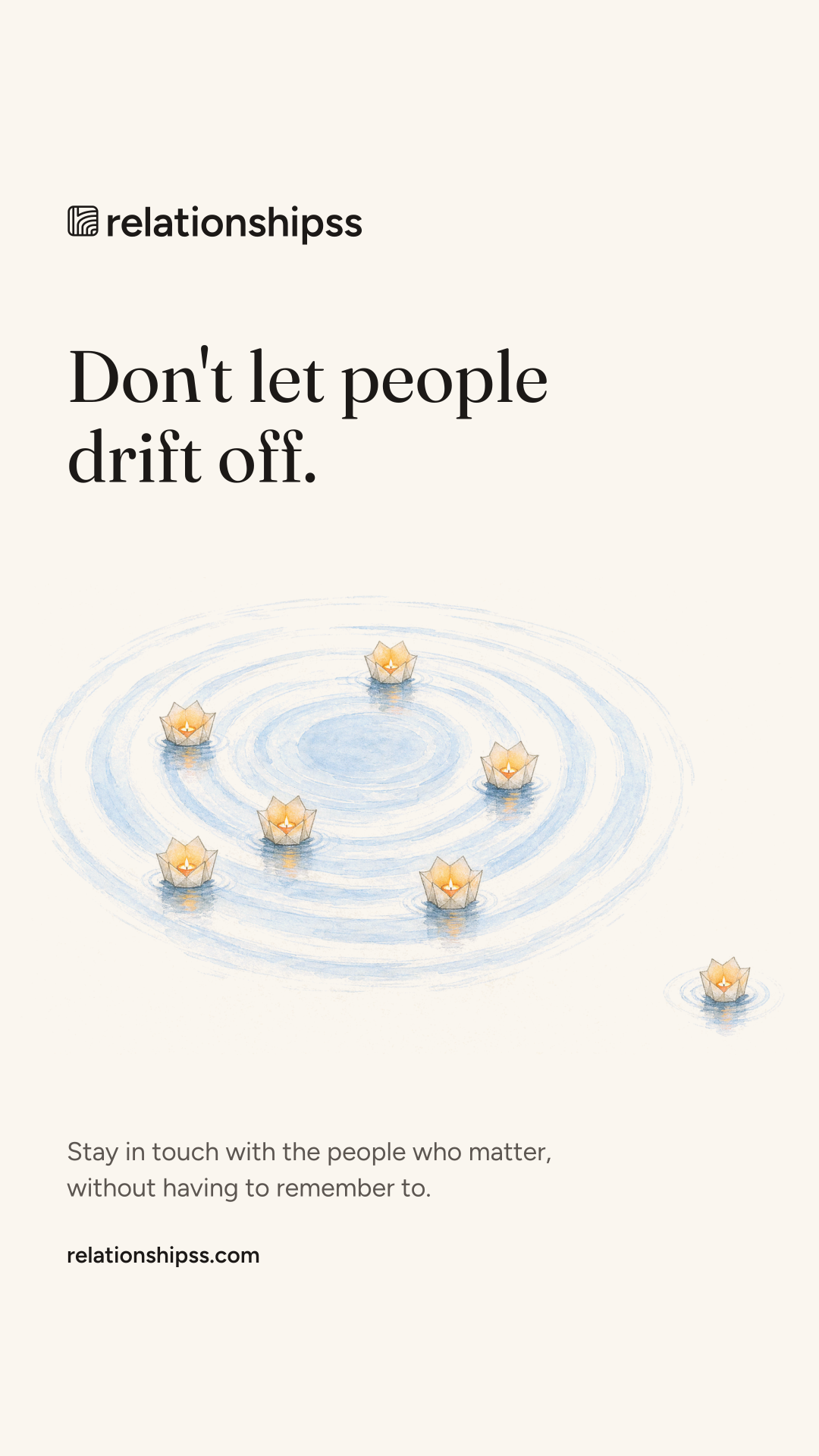
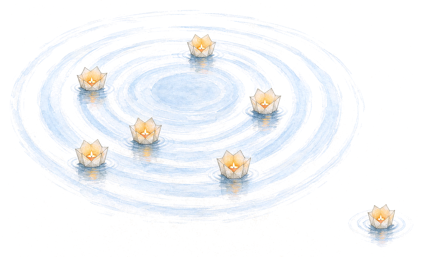
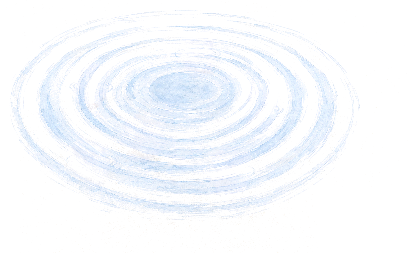
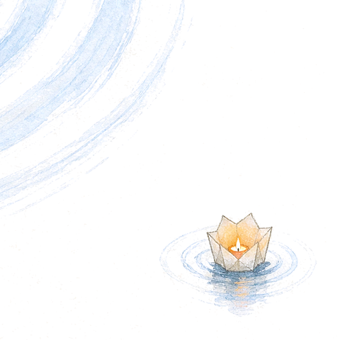
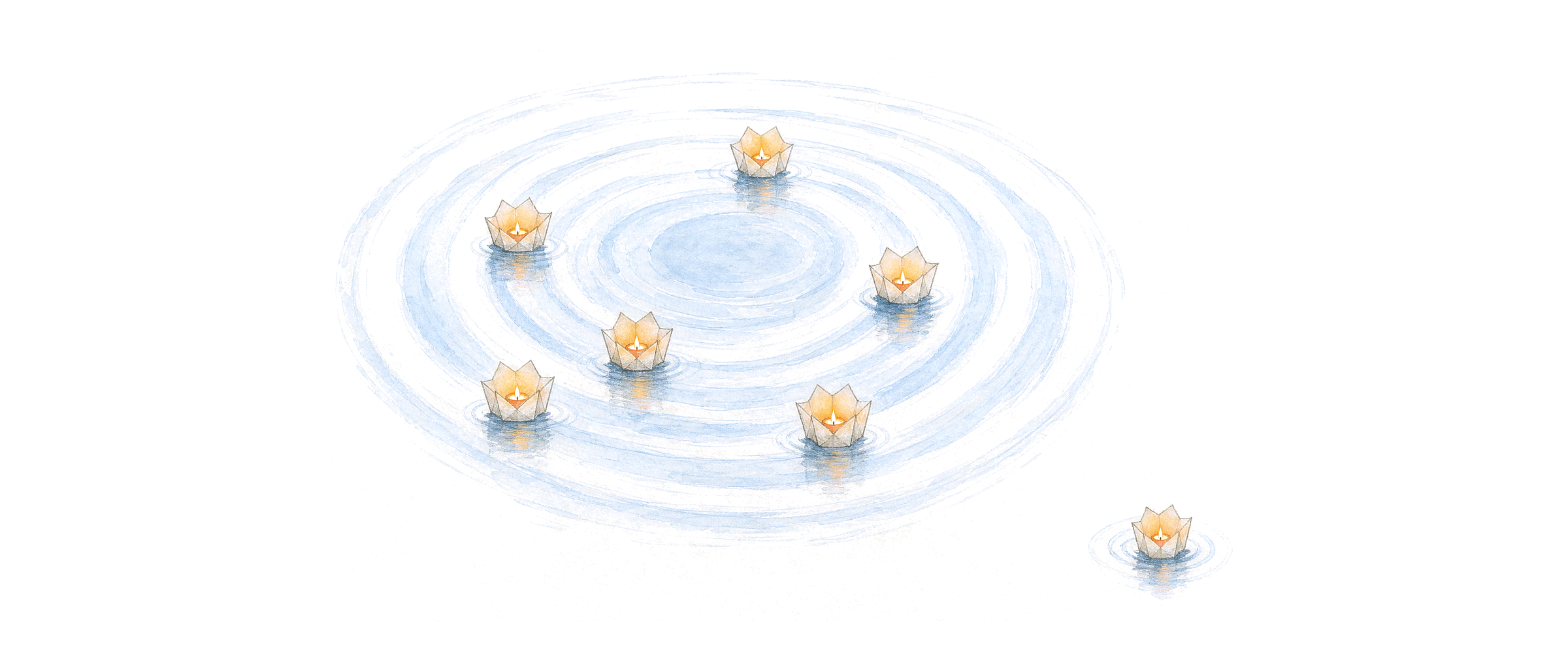
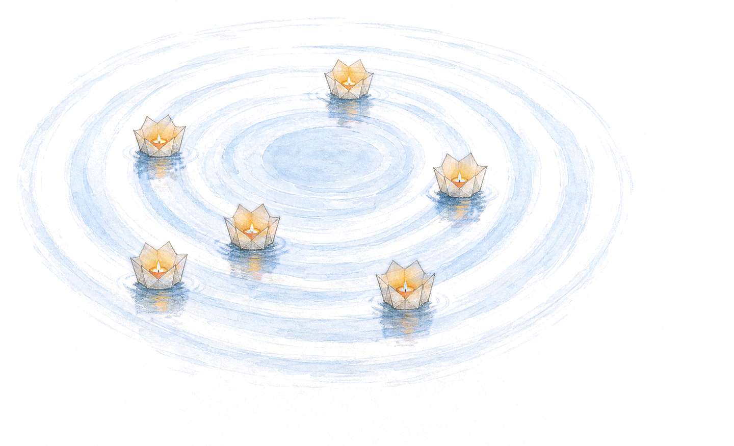
Coloured pencil on cream paper. A quiet pond seen from a little above, so the ripples make a wide oval. You are the still point. People are floating paper lanterns, lit, each on its own ring. One has slipped past the last ring and sits alone on open water, with a small ripple of its own.
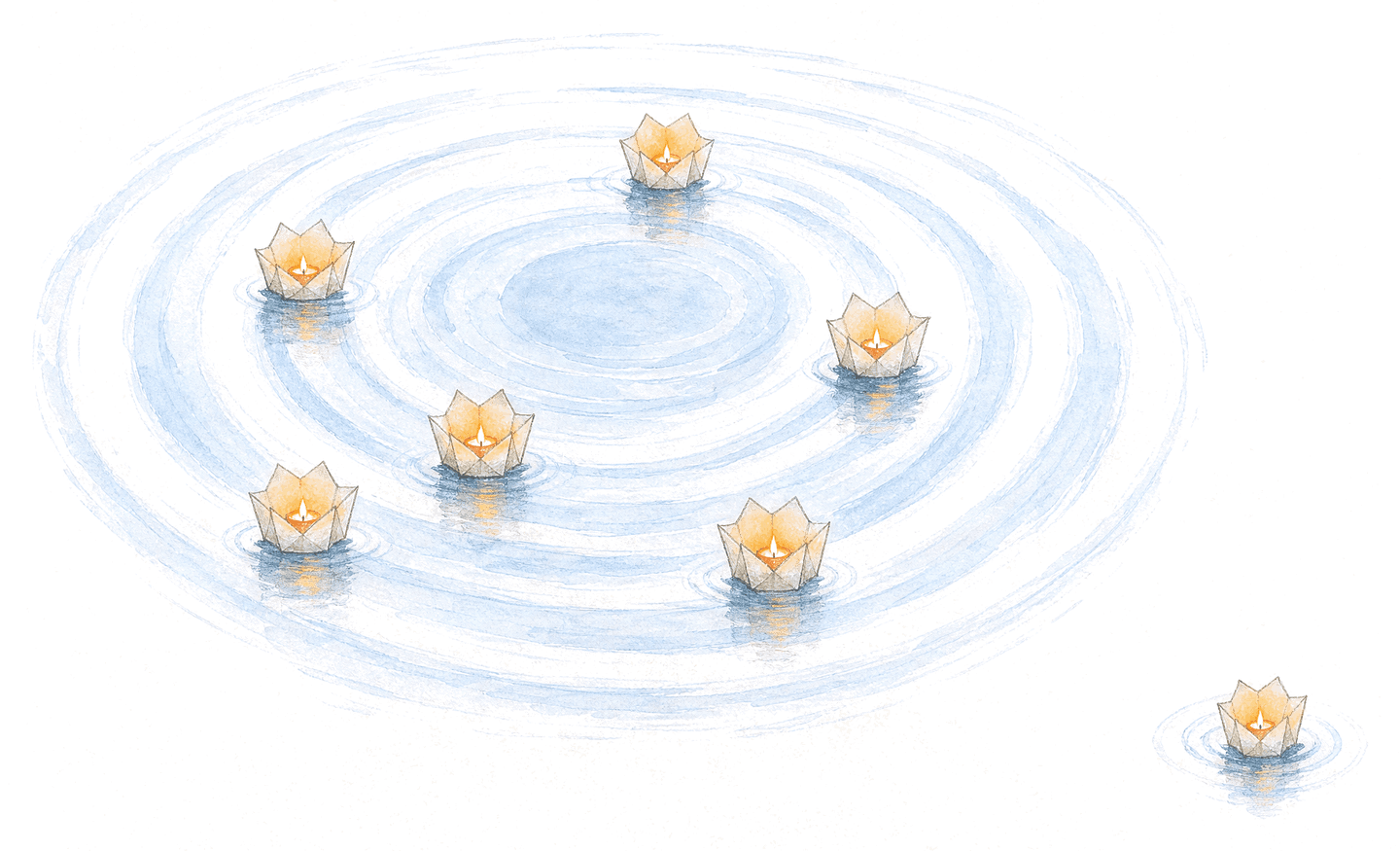
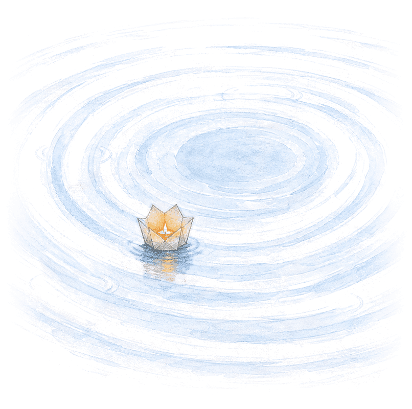
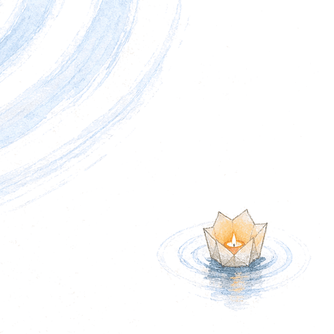
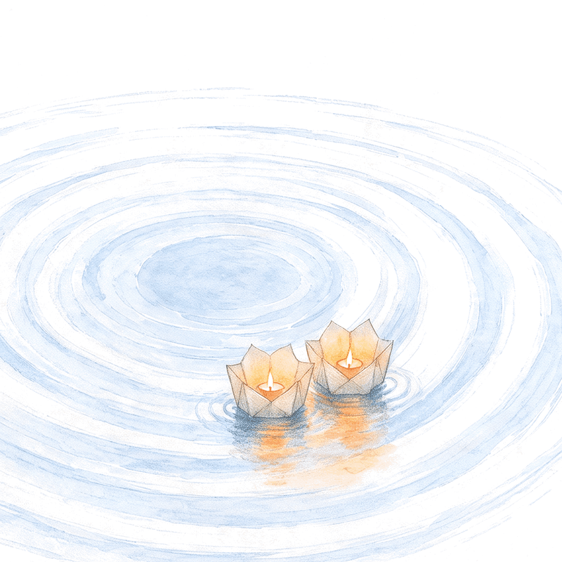
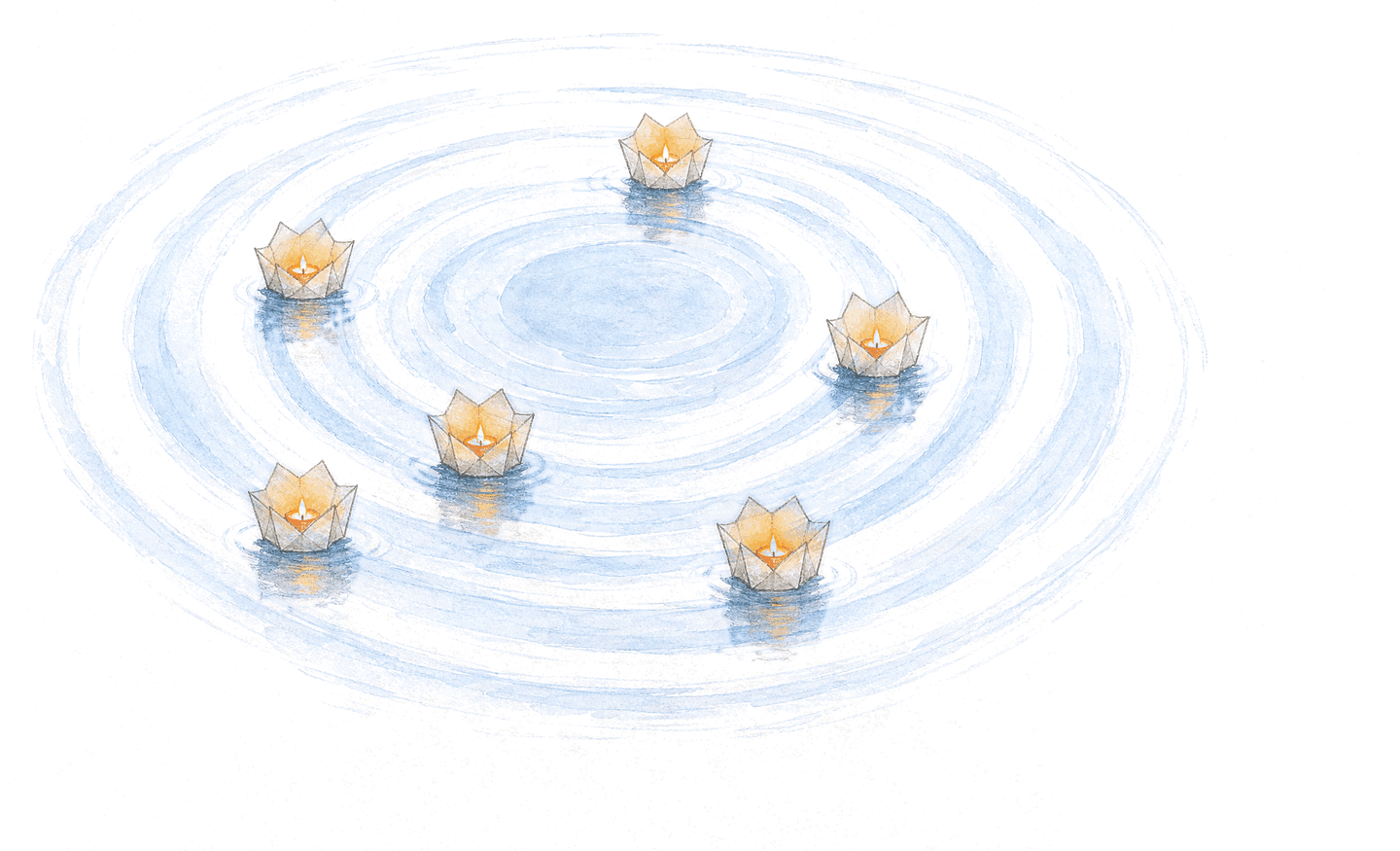
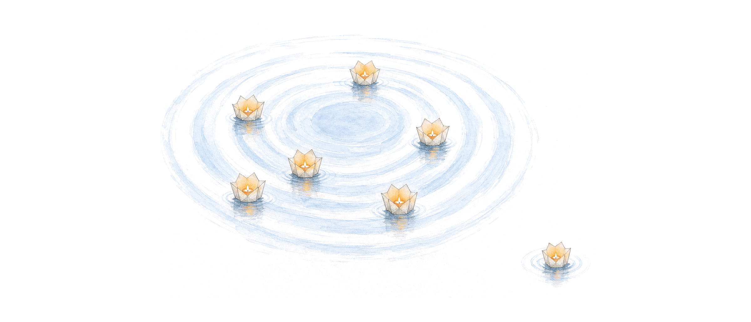
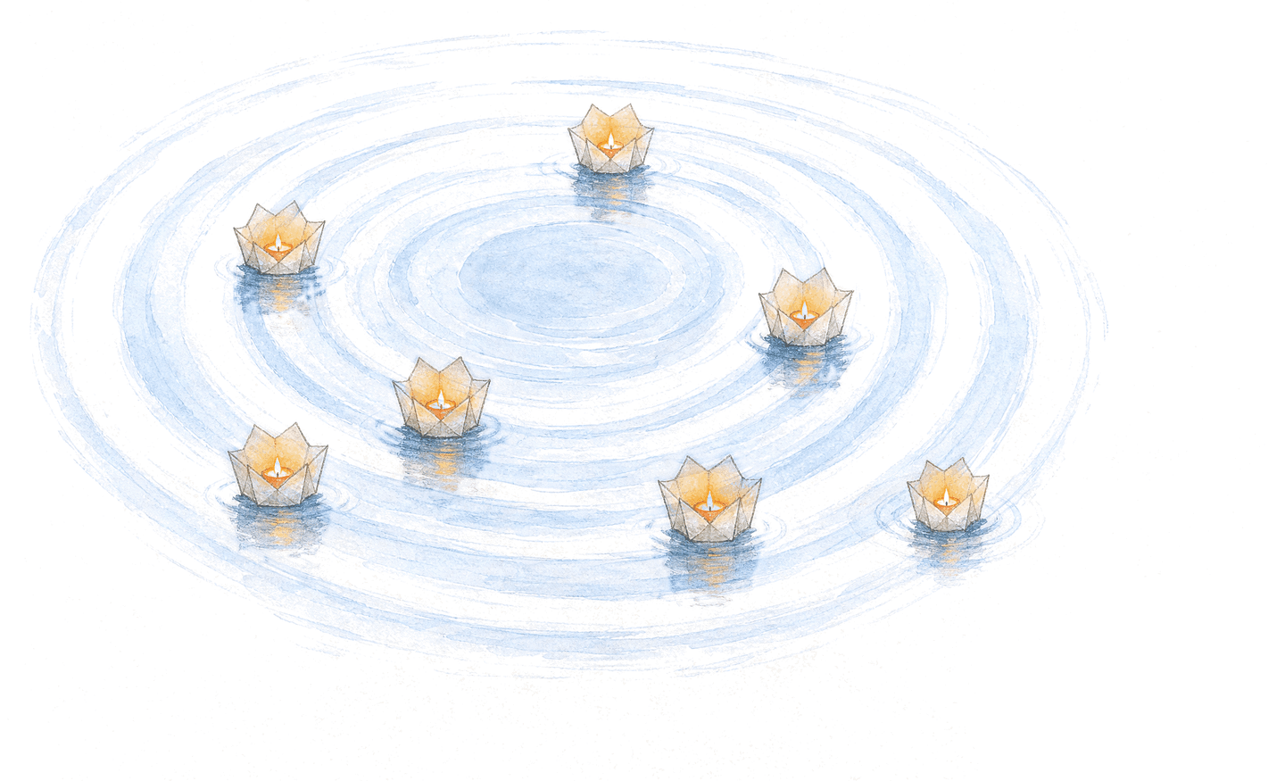
- Lanterns are people. The still point is you. Rings are distance. Nothing else gets a symbol.
- No threads, no strings, no boats, no stones, no hands. Nothing tethers anyone.
- The pull is shown by the water: a ripple reaching out, a ring bending. Never a line.
- Sky blues for water, ember and warm paper for light. The paper itself is never drawn; the page is the paper.
- New pieces are cut from the pond’s own layers, so every one is in the same hand. A new drawing is a last resort, and it must match the pond before it is used.
In 3D
The same pond, built as a place: a water surface that ripples on its own, and the seven lanterns as lit paper on it, textured in the same hand. The camera starts where the drawing was made from, so it is the picture first; then you can look around it.
- It is the drawing, not a new style. Same paper, same blue, same lanterns, same places.
- Nothing is added that the drawing does not have: no sky, no shore, no horizon. Paper all the way out.
- The lantern model is a file on that page, for anyone who builds with it.
The mark in relief
A shallow relief built from the approved lines, each extruded at its exact weight. Use it as a supporting dimensional study; keep the flat artwork as the signature. The kit includes GLB and OBJ models, a rendered preview, and their source script.
Where the drawings live
- Home, before anyone is addedThe pond, moving. Then the picture takes over.
- Why this existsThe open door, above the title. Nothing between the paragraphs.
- Sign in, and check your emailOne close.
- Page not foundGone quiet.
- The sign-in emailThe pond, at the top.
- The share cardThe pond, beside the headline.
Each one is cut from the pond or drawn from it, so a page never introduces a second hand. A page with no drawing is better than a page with a new one.
Icons
Drawn in the hairline the picture uses: a 24-unit square, a stroke of 1.6, round ends, nothing filled except the still point and a flame. The lantern is the same lotus that floats on the pond. They take the colour of the text beside them.
Motion
Water, not interface. Everything that moves, moves the way the picture would: slowly, and as itself. The lanterns bob. The water in the drawing ripples, because the drawing itself is animated, not a mask laid over it. When someone comes home, their lantern glides back and a ripple spreads from it.
- Very slow. If it feels right at first, halve it.
- Nothing still is ever drawn over something moving. No outline rings, no spinners, no pulses.
- Two speeds for the interface: 240 milliseconds for a touch, 600 for a glide, on one ease curve.
- Anyone who asks their system for less motion gets the still picture, and loses nothing.
The card and the app icon
The share card is the headline in plain words beside the pond. The app icon is the mark alone on paper, with generous room around it. Let the system apply its corners. Keep the icon free of words and extra detail.
The launch pack
The headline, the pond, and the shared ripples, sized for the place they will appear. The kit includes editable vector sources, profile art, covers, posts, stories, and two gallery images. The film is twenty seconds of the home page: the water moving, the words rising, the far lantern coming home.
Use the company cover for a company page and the personal cover for a profile. Preview each crop on its destination before publishing. Put the message in the post’s text as well as the picture.

In print
A contact card, letterhead, postcard, and poster. Paper, ink, generous space, and the same shared ripples. The print artwork uses vector shapes and outlined letters so it stays sharp at its intended size. The kit includes editable SVG sources, PDF proofs, and PNG previews.
- Contact card: 85 by 55 millimetres. A6 postcard: 148 by 105. A3 poster: 297 by 420.
- Edge-to-edge pieces include 3 millimetres of bleed. Keep essential words within the marked safe area.
- Letterhead comes in A4 and US Letter, with room for real correspondence.
- Use the one-ink artwork when the printing process requires solid black or white.
The PDFs are RGB proofs. For a commercial run, ask the printer for their colour profile, paper, bleed, and PDF preset, then approve a printed proof. There is no universal CMYK or spot-colour match.
Using the brand
Choose the file for the job
Use SVG for the sharpest identity artwork and PNG where a tool needs an image. Transparent exports leave the background to the layout. App icons have an opaque ground and room for the system’s crop. Keep the wordmark and mark in their supplied proportions.
Keep it readable
Use ink on paper, or paper on ink. Ember ink and sky ink are the readable text colours; the lighter colours belong to illustration and supporting fills. Pair any colour meaning with words. A logo beside the name is decoration; a logo standing alone needs the accessible name “Relationshipss”.
Leave room for another name
In a partnership, give both signatures the same visual weight and leave a full mark’s width between them. Keep them separate. In prose, use Relationshipss; use the supplied lowercase artwork for the signature.
Use the current release
This page and its kit are the starting point. The asset index lists the current files, sizes, and formats. The kit includes font licences, production notes, and the stock list. Update the masters and regenerate the exports together so each touchpoint stays in the same hand.
Files
The current release, organised by use. The kit includes transparent logo exports, editable social and print sources, native icon layers, fonts, and production notes alongside these individual downloads. Signature letters are outlined, so no font is needed to place a logo.
Identity and guidance
- Complete brand kitZIP, all current exports and sources
- Identity reference sheetPDF, colour, type, and use
- Asset indexJSON, sizes, formats, and checksums
- Production guideHow to use, edit, and regenerate the files
- Lockup, ink on lightSVG, outlined wordmark
- Lockup, for darkSVG, outlined wordmark
- Mark, inkSVG, the full cut, from 48 pixels
- Mark, for darkSVG, the full cut
- Middle mark, inkSVG, five lines, for 24–47 pixels
- Small mark, inkSVG, four lines, for 16–23 pixels
- Small lockup, inkSVG, with the small mark
- Wordmark, inkSVG, outlines
- Wordmark, for darkSVG, outlines
- Colour tokensCSS, light and dark
- Colour, type, shape, and motion tokensJSON
- Logo constructionSVG, geometry and reproduction rules







Digital and social
- Browser faviconICO, 16, 32, and 48 pixels
- Scalable faviconSVG
- Apple touch iconPNG, 180 by 180
- Web app iconPNG, 192 by 192
- Maskable web app iconPNG, 512 by 512, padded for the system crop
- App icon masterPNG, 1024 by 1024, square and opaque
- Profile avatarPNG, 400 by 400
- The share cardPNG, 1200 by 630
- X headerPNG, 1500 by 500
- LinkedIn personal coverPNG, 1584 by 396
- LinkedIn company coverPNG, 1512 by 256
- Portrait postPNG, 1080 by 1350
- StoryPNG, 1080 by 1920
- Product Hunt, introductionPNG, 1270 by 760
- Product Hunt, how it worksPNG, 1270 by 760
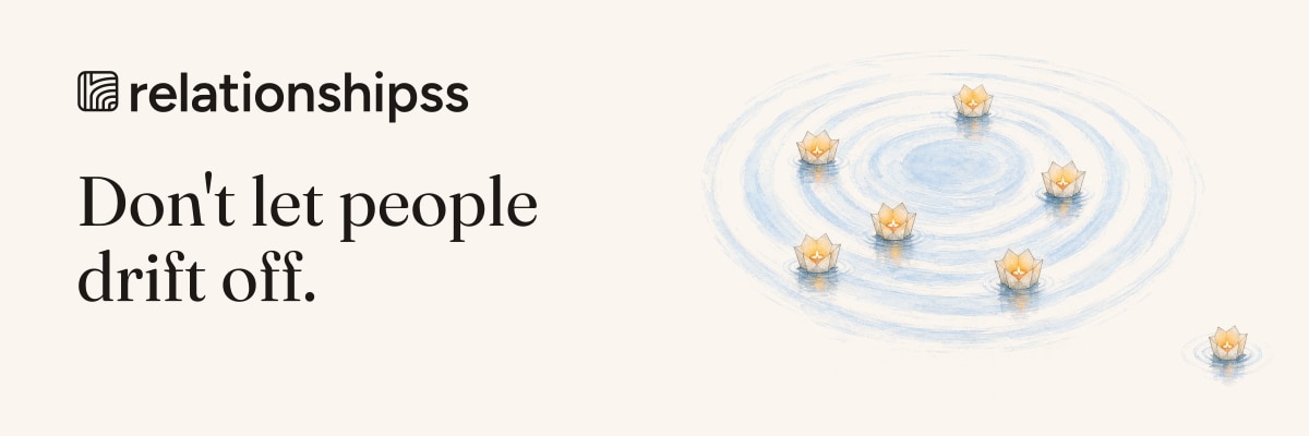
- Email headerJPEG, 1200 by 400
- Email signatureHTML, editable text


Motion and 3D
- The filmMP4, twenty seconds, silent
- The mark, arrivingSVG, the lines draw once, with a still alternative
- The mark in reliefGLB, dimensional composition model
- Relief meshOBJ, use with the material file
- Relief materialMTL, companion to the OBJ
- Relief previewPNG, 1600 by 1200
Print templates
- Contact card, both sidesTwo-page PDF proof, 85 by 55 mm plus bleed
- A4 letterheadPDF proof, 210 by 297 mm
- US Letter letterheadPDF proof, 8.5 by 11 inches
- A6 postcard, both sidesTwo-page PDF proof, 148 by 105 mm plus bleed
- A3 posterPDF proof, 297 by 420 mm plus bleed
Illustrations and product icons
- Icon setSVG, eight product symbols
- The pondPNG, transparent
- The water alonePNG, transparent
- One closePNG, transparent
- Gone quietPNG, transparent
- The wide pondPNG, 21 by 9, transparent
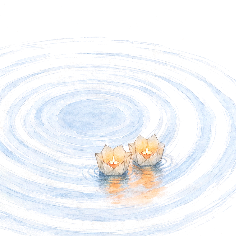
- Two closePNG, transparent
- Everyone closePNG, transparent
- Back on the ringPNG, transparent

Never
- Never a photograph of people. Lanterns stand for people so that nobody’s face does.
- Never ember as a background, a button you press every day, or a decoration.
- Never a count of how many people you have let go quiet. One name, today.
- Never an exclamation mark, an emoji, or a badge.
- Never a thread, a string, a boat, or a stone in the picture.
- Never alter the flat signature: no different colour, rotation, shadow, or photo background.
- Never bare “drift”. It is always “drift off”.